Sunday, 11 April 2010
Message from Ms Prince
Your blog has now been marked for research and planning. Any subsequent evidence of research and planning work will not count towards your final grade.
Tuesday, 26 January 2010
Magazine
Front Cover

CD Version

Contents Page

Main article 1

Main article 2

Preliminary Work


Evaluation
1) In what ways does your media product use, develop or challenge forms and conventions of real media products?

- My magazine uses conventions of real media products through a number of ways. Firsty regarding the front cover, I have included the majority of features which are typically present on a magazine front cover. I have included a masthead, coverlines, main image, tie-in/puff. I have also included marketing techniques such as using a direct mode of address for the main image(image looking directly at the viewer). I have also included freebies. In this case I decided to used a free CD. I think this further helps to make the front cover more appealing. To further increase the authenticity, I have included typical features such as a bar code, the price and the date.
- This is my magazine front cover with a free CD. Music magazine generally have freebies with then to further attract audiences to their magazine. I have included this on my magazine as I believe that it an effective method of appealing to audiences.

- On my contents page I have also included the features of a typical music magazine contents page. I have used several images with the artists that are featured in my magazine. I have also included an editors note. This somewhat makes it more personal as it is a personal message from the editor himself. I have included a 'regulars' section and a 'features' section, with the appropriate page numbers. The purpose of this is to complement to front cover as the front cover helps to grab the attention of the reader, and the contents page informs the reader of what else is in the magazine. I have also included a quote from an artists, which is another typical feature of a hiphop magazien contents page.
- My double page spread consisted of a main article. This was an interview with my main artist 'Grinder'. I decided to put the font in columns as this is how the main articles of music magazine typically are. I also put 2 images of my main artists. I used different camera shots as I wanted a variety of poses. I used a black background as this contrasts the writting as therefore helps it to stand out. I also put the title 'EXCLUSIVE INTERVIEW WITH GRINDER' in a white font as this also stands out agaiinst the black background. In conclusion, my magazine uses the typical features which are present it typical music magazines.
2) How does your media product represent particular social groups
- My magazine represents social groups through its different lines of appeal. On my contents page it has a section entitle 'M.E talks on drug scandal'. This could appeal to social groups who are involved in the taking of drugs, and therefore they can relate to the content and also the artist. There is also a section entitle 'Bouncer releases clothing line'. This could appeal to sections of society who are into fashion and the latest trends.
- The fact that the artist is releasing a clothing line would help draw interest into this section of society. The section entitle 'upcoming giggs' may help to attract sections of society who lead a modern lifestyle and like to go to concerts or parties. On my contents page there is an image of an artists holding up money. This appeals to individuala who are materialistic and aspire to be wealthy.
- On my front cover it has an image of a hiphop artist. This could appeal to sections of society who like music and are into the hiphop culture, and the image of the artist could attract viewers as they might want to emulate the artist and live the lifestyle of famous singers and actors. It may also appeal to individuals who a fashion conscious and want to emulate the latest fashion trends. This represents young people in the sterotypical manner as they are generally seen to want to emulate the rich and famous lifestyle.
- In my main article, the interviewer and the interviewee are speaking in formal dialect. This goes against the stereotypical view that singers and rappers us slang and informal language. Through looking at this article, it represents this part of society in a positive light as being formal and polite. For example the intervier asks questions in a formal manner such as 'how has all the fame and attention been like'.
- Also in my main article it talks about how the artist started out in life in a not so well off background and worked his way up to get rich. This could appeal to sections of society who are also not very well off and inspire them to work hard and get wealthy.
3) What kind of media institution might distribute your media product and why
- The publisher that would most likely distribute my media product IPC media. IPC publishes the music magazine NME which is in the rock/hiphop and pop genre of music.

- IPC Media has five magazine divisions:
Connect - This specializes in womens magazines such as Now Magazine and Look
Inspire - This is the leisure and specialist genre of magazines
Ignite - This is mainly mens lifestyle and entertainment
SouthBank - This genre is to do with womens lifestyle and home interest
TX - This division publishes portfolio of television titles

- Through the many divisions of IPC, it uses a range of convergence technologies. IPC also owns Time Warner Inc. This could help the success of my magazine as the artists of my magazine could be advertied on television through the use of adverts and music videos. As a result it would help my magazine as the exclusive interviews of the artists are only available throguh my magazine and therefore this will significantly increase the sales of my magazine.
4) Who would be the audience for your media product
- My magazine is aimed at audiences of the age group 15-24. This is done through several ways. The main image on my front cover is of a sterotypical looking artist. He looks confident through his pose, and his designer glasses connote that he is wealthy. This creates an aspiration for the audience as they want to aspire to look like the artists an emulate him in his appearence. Overall it is aimed at individuals of a middle class background who lead a modern lifestle with
materialistic values and desires.
Audience Profile

- Above is a montage of the type of social background that my audience would come from. They would come from a middle class background and lead a modern lifestyle. They would most likely be a student in colledge or university who lead the lifestyle associated with university. They would spend their money on things such partying, alcohol, money and generally having a good time. This would generally be a materialistic lifestyle.
- The image of sports represents that the audience would be into sports, American sports in particular. Generally hiphop culture is associated with American sports such a basketball. The picute of the women shows that the audience would also into women and sex. The picture of money shows that the audience would be interested in money and wealth.
There are 5 main types of people in society
1. Mainstreamers - There are people who go with the flow and dont stand out.
2. Aspirers - The second group of people are the ones who desire more wealth or a different life and will often buy flashy products as status symbols.
3. Succeeders - They have money and the life but dont want to show it off.
4. Individuals - They want to show the world they are different.
5. Carers - They want to save the world.
- I think that the main target audience for my magazine would be the mainstreamers and apsirers. This is because mainstreamers would want to purchase the magazine to fit in with the crowd and share the same interests and aspirations as the majority of society. The apsirers would want the magazine because they aspire to be like the rich and famous, and therefore try to immitate them in their lifestyle and conduct.
5) How did you attract/address your audience
- I attracted my audience through a number of ways. Firstly through my front cover, on my main image I used a direct mode of address. This helps to attract the audience as the image is looking directly at the reader and therefore this makes it more personal than if the image was not looking directly at the reader. The image is of a stereotypical hiphop/rap artist. He seems to be dressed in a fashionable way and this could attract audiences as they want to aspire to be like him and emulate him through his fashion sence. Also on my front cover I had included a free CD. Through my research I have found that freebies help to attract customers as they believe they are getting a bargain as they are getting more for their money.

- Also on the front cover there is a coverline saying 'exclusive interview with Dice'. The word 'exclusive' would help to attract the audience as the interview is only available in my magazine, and therefore the only way to read the interview is to purchase my magazine. The masthead 'Mayheam' helps grab the readers attention as the big red font contrasts the dark background, and therefore it helps it to stand out.
- On my contents page I have included a main image of an artist holding up money. This connotes wealth and success, and this could attract audiences who also have materialistic desires. Due to the size of the image, it immediatley grabs the attention of the reader when looking at the page.
- The page 'Terminator speaks on scandal' attracts readers due to the nature of humans, that humans are generally intrusive into the personal lives of other humans, and especially celebrities. This will therefore provoke the interest of the reader and them eager to read on.
- There is an editors not on the bottom right of the page. This makes it more personal for the reader as it is a direct message from the editor, and therefore it will make the reader feel more involved.
- For my double page spread I decided to do an exclusive interview with the main artist. This attracts viewer as the interview is exclusive and only available in my magazine. In the interview the artists is speaking about his personal life. He talks about how he started out in life in not so well off background and worked hard to get rich. This interests viewers who could relate to the story and know that with hard work it is possible to get wealthy no matter your background. The story could be somewhat of an inspiration for the reader.
- Also in my article it speaks about the artist flying overseas to America. The artist states 'My trip to the US was absoutly amazing'. This could interest fans who want to know about the personal lives of famous celebrities, as this could be a form of escapism for the reader.
- The images used on my double page spread also attract the viewer. I have used a special glow effect around the images. This makes the images stand out against the black backdround, and therefore grab the sttention of the reader. The glow effect makes the artist seem important as is like a symbol of status. The images also use a direct mode of addess, which further help to make it more personal for the reader.
6)(What have you learnt about technologies from the process of constructing this product) & 7)(Looking back at your preliminary task, what do you feel you have learnt in the progession from it to the full product)
Research and planning
Main article analysis

This is the main article of a music magazine. The main image is placed on the right side. It is a close up shot of the featured artists. This is effective as the viewer will know who the article is about. The close up shot is really effective as it is focused on the face of the artists. It takes the the whole of the page and therefore this makes it stand out to the viewer. There is also a quote from the main artist beneath the title. The use of a quote makes it more personal and gives the viewer a personal insight on the views and thoughts of the main artist. The main article consists of the background information of the artist. This is effective as it gives the viewer a better understanding of the personal life of the artists, and this enables the viewer to relate to the artist. The title used for the main article is 'up close & personal'. It is written in a large bold font in an uppercase format. This make it stand out and grab the attention of the viewer. The connotations of 'up close & personal' is that it gives the viewer the sense that they are getting an insight into a personal life of a celebrity. This may also creates a sense of escapism for the reader as reading about a celebrity may distract them from their own problems is life.
Main article draft
Unused images

I did not use this image as firstly i was slightly blurred. This makes the image look unprofessional, and would therefore not be an appropriate image to use for my front cover. Another defect with this image is that it is in a low angle shot. This is not generally used im music magazine, and therefore I thought that this would not be an appropriate image to use.

I did not use this image for my magazine front cover as it was too much of a long shot, and music magazines generally do not use long shots for their main image on their front cover. I also found that this image does not use direct mode of address, which is more effective to use for a main image.
Masthead Designs

Front cover 1st draft (computerised)

This is the first computerised draft for my front cover. Although I thought it was fairly effective, I decided not to use this as my front cover. Overall I thought there was a lack of colour as the primary colours used where red, black and white. I felt that there was not much of a variety of colours, and therefore it would not be very attractive for the viewer to look at. I also felt that there was a lack of cover lines used, and this made the front cover look empty and unprofessional. I also felt that the positioning for the main image was ineffective, and I feel that it would be more appropriate going in the centre. The background was not very effective as it was a plain black colour, and this did not help to make the masthead to stand out.
Contents Pages 1st Draft

This is the first draft of my contents page. I am going to put two image of my artists. One on the top right and one on the bottom left. I am going to put the subheadings of my magazine around the images and the page numbers to the side of the subheadings. I do not want a very flashy contents page. I am going to keep it in a simple layout. Thee background of my contents page is going to be identical to the one on my front cover. I am also going to keep the font in a simple style and and use black as the colour.

Analysis of Kerrang contents page
This is the contents page for the Kerrang magazine. The main image on the left is of a stereotypical rockstar. He has tatoo's all over his body, a messy beard and he is doing a stereotypical rockstar pose with his hand. The background of the image is black. This is seen to be attractive to a typical rock audience, and this therefore makes the contents page look more appealing. The additional images that we see around the main image are also images of rockstars. We see that there are images of live performances. This helps to add authenticity and can be seen as 'eye candy'. The page numbers are written in a small yellow font. On the bottom right, there is an advertisment. There are red sub, which are designed to convey power to the audience. At the top there is an editorial. It is a message from the editor and it contains a signature. This helps to make it more personal and authentic. On the top right there is the contents page title. It is written in a yellow font, which contrasts against the black background. This is to help it to stand out, and therefore grabs the attention of the reader more effectivly. The colour also helps to establish the brand identity. Beneath this are quotes from an artists. There are subheadings which contain the the page numbers and informs the reader of the contents of the magazine. There is a section called "Features" which contains their unique selling points about major artists such as Walls of Jweicho, Enter Ahikari and Goria.

Analysis of Vibe Contents Page
The Vibe contents page is a very effective contents page. The main image of the artists is placed at the bottom of the page, and takes up the majority of the space of the page. The image is of a half naked artist. This would attract a male audience as it creates sex appeal. It could also attract a female audience as females may want to aspire to be like the artist. The image is using a direct mode of address as it is looking directly at the viewer. The background used for this page in a fairly plain background, using simple colours. The colours used are black and white. There is a faded effect as the black slowly transitions into white as it goes further down the page. This helps to make the masthead ‘contents’ which is written in a bold white font to stand out. Beneath the masthead there are the main contents of the page. There is a section entitled ‘features’ and a section entitled ‘fashion’. The page numbers are written in a small black font.
Draft of double page spread/Main article


This is a rough draft of the inside of my magazine. It is in a double page format, and it will contain my main article. For my main article I am planning to do a Q&A with my main artist. I am also going to use some images to make my magazine look more professional. For the title I want to use an attractive font which will make it stand out from the background, as I am going to use contrasting colout to my background.
Firstly i analysed several genres of music magazines and made annotations to compare the different presentational devices used on the front cover. I annotated how this was effective in attracting the target audience of the magazine. Then i analysed the different features of a front cover that is essential for all music magazines to have, as i would use this for my own magazine. After analysing the different genres of music magazines, i came to the decision that my magazine would be based around the hip-hop genre.
Front Cover Analysis
The magazine cover that i am analysing is XXL. The magazine cover uses several presentational devices to attract its audiences. These include alliteration, cover lines, main cover line, maine image, puff and tie-ins.
The USP - unique selling point of the magazine is the XXL masthead at the top of thepage. It is written in a big font to make it stand out. The red connotes excitement. It also has diamonds which connotes wealth. It utilises various cover lines stating the different artists featured in the magazine. This is to attract a wide range of audiences and is one of the main selling points of the magazine. The main image is of the two rappers 'Baby' and 'Lil Wayne'. Both rappers have a large amount of tatoo's and jewelry on their bodies. This helps to connote wealth. Both men are also topless. This could help to draw female audiences who would find this attractive. This could also help to attract a homosexual audience as topless men may attract a homosexual man. Another possible view is that it could connote toughness. Through the main image alone, it helps to attract a wider range of audience. The coverlines used are the names of several popular hiphop artists. This is one of the main selling points if the magazine as it helps to attract a fan base of several artists. It also uses 'puffs' which help tp make the front cover look more attractive. At the bottom of the magazine, we can see contact information, which is the website. The coverline containing the names of the artists featured within the magazine are successful in confirming audience expectations as the audience also expect to see some of their other favourite artists featured in the magazine. Utilizing these coverlines meets these expectations. The main image of the two rappres is also successful in confirming audience expectations as it is the centre of attention on the front cover, and it is a typical convention of a hip hop magazine. The logo of the magazine, XXL also meets audience expectations as it connotes wealth and it also writeen in contrasting colours which helps it to stand out. The connotation of wealth is an attraction to the typical audience of a hip-hip magazine. The main coverline(Baby&Lil Wayne) is also a successful feature of the front cover as it informs the viewer of the two main artists on the front cover. The background image is of a broken down house. This could be to attract young males who are attracted by the gangster culture as it shows two rich men in front of a broken down house which assumably is part of a area with high levels of poverty.
In conclusion, i think this front cover is highly successful in targeting its target audience as it contains the main features which are typical in a hip-hop magazine, however in my opinion i believe the front cover is a bit too 'flashy' and that it should be in a slightly more simple layout.

After this, i made a rough sketch of my magazine, to give me an outline of how my front cover will look like. I added all the features of a typical hiphop magazine front cover. These include a main image, coverlines, masterheads and background colours. This is to attract a hiphop target audience from the age range of 14-27. I decided to use a Medium shot looking straight on (direct mode of address) because following my research I have found that music magazines predominantly use direct mode of address. This is to make it more personal and made the reader involved in the front cover. I have chosen to make the name of my magazine 'music mayhem'. This is because the music industry generally always filled with the latest news and updates on artists, albums, songs ect. The title 'music mayhem' therefore connotes all the havoc and mayhem that is present in the music industry. I have chose the colour of my title to be in red as the colour red connotes energy and excitment. Another reason i used the colour red is through my research I have found that the majority of music magazine have the colour red somewhere on the front cover. I have decided to put the cover lines around the main image as this is an ideal location which would easily grab the attention of the reader. The cover lines are also in red which is a very bright and eye catching colour. This would again help the grab the readers attention. I have decided to put the bar code at the bottom right of the page. This is a typical location for bar codes on magazines and therefore this is why I decided to place my barcode in that location.
After creating a sketch of my front page, i made some audience questionnaires, asking the audience their opinions on music magazines. My questionnaire consisted of 12 questions, for the audience to either write down their answer or tick their preference in the tick boxes. I have mainly used closed questions as when people do questionnaires they want it to be a quick and easy proces.If I used mainly open questions then it would be very time consuming and this would put people off from doing the questionnaire.The objective of this questionnaire was to find out what was the most appealing features of a music magazines and what people would like to see. One of the questions was 'What genre of music do you prefer'. This was to find out the most popular genre so that i may base my magazine around this genre. Another question was 'What type of freebies would you like with your magazine'. This was to find out what was the most popular response so that i could use it for my magazine and make it more appealing to the viewer. I also asked the question 'How much are you willing to spend on a music magazine'. This is so that i could take the most popular response and base the price of my magazine around that price so that is would be more successful.
After i collected back the results of my audience questionnaires, i made these into graphs on microsoft powerpoint. I also wrote down comments on the results to show what the most popular resonses where.
Focus group audio interview
Texual Analysis

Both magazines use bold red font in upper case format. They are also written in a relatively large font. This is to make the logo/masthead instantly recognisable and to make it stand out. It grabs the attention of the viewer very effectively. Both Q magazine and NME share the same style of font.
In addition Q utilises a main image of three middle aged actors/singers. This may be used to attract a target audience of an older (25+) age group. On the other hand NME use the main image of a teenage boy band. This may help appeal to both male and female audiences of 14-20 age group who are into the rock/hiphop and pop genre of music.
The cover lines in the Q magazines are written in bold and brown typography. This helps tp grab the attention of the viewer and create an interest. In the NME magazine, we see at the top a coverline stating 'win awards tour tickets'. This also attracts the viewer through the use of competitions.
The backgrounds of both magazines also contrast as Q has a plain and simple white background and is contrasted by voloured lines and fonts. This helps to appeal to a more sophisticated audience. On the other hand the NME magazine is hardly visible as it is covered mostly by images, which helps to attract a younger, teenage audience.
Both magazines also utisise different font styles. The Q magazine uses simple and sohisticated font styles and covers. It is contrasted by the white background, and it therefore stands out. In the NME magazine, it uses a more stylish font and a wider variety of covers which help appeal to a younger age group.
Diary entries for practical work

CD Version

Contents Page

Main article 1

Main article 2

Preliminary Work


Evaluation
1) In what ways does your media product use, develop or challenge forms and conventions of real media products?

- My magazine uses conventions of real media products through a number of ways. Firsty regarding the front cover, I have included the majority of features which are typically present on a magazine front cover. I have included a masthead, coverlines, main image, tie-in/puff. I have also included marketing techniques such as using a direct mode of address for the main image(image looking directly at the viewer). I have also included freebies. In this case I decided to used a free CD. I think this further helps to make the front cover more appealing. To further increase the authenticity, I have included typical features such as a bar code, the price and the date.
- This is my magazine front cover with a free CD. Music magazine generally have freebies with then to further attract audiences to their magazine. I have included this on my magazine as I believe that it an effective method of appealing to audiences.

- On my contents page I have also included the features of a typical music magazine contents page. I have used several images with the artists that are featured in my magazine. I have also included an editors note. This somewhat makes it more personal as it is a personal message from the editor himself. I have included a 'regulars' section and a 'features' section, with the appropriate page numbers. The purpose of this is to complement to front cover as the front cover helps to grab the attention of the reader, and the contents page informs the reader of what else is in the magazine. I have also included a quote from an artists, which is another typical feature of a hiphop magazien contents page.
- My double page spread consisted of a main article. This was an interview with my main artist 'Grinder'. I decided to put the font in columns as this is how the main articles of music magazine typically are. I also put 2 images of my main artists. I used different camera shots as I wanted a variety of poses. I used a black background as this contrasts the writting as therefore helps it to stand out. I also put the title 'EXCLUSIVE INTERVIEW WITH GRINDER' in a white font as this also stands out agaiinst the black background. In conclusion, my magazine uses the typical features which are present it typical music magazines.
2) How does your media product represent particular social groups
- My magazine represents social groups through its different lines of appeal. On my contents page it has a section entitle 'M.E talks on drug scandal'. This could appeal to social groups who are involved in the taking of drugs, and therefore they can relate to the content and also the artist. There is also a section entitle 'Bouncer releases clothing line'. This could appeal to sections of society who are into fashion and the latest trends.
- The fact that the artist is releasing a clothing line would help draw interest into this section of society. The section entitle 'upcoming giggs' may help to attract sections of society who lead a modern lifestyle and like to go to concerts or parties. On my contents page there is an image of an artists holding up money. This appeals to individuala who are materialistic and aspire to be wealthy.
- On my front cover it has an image of a hiphop artist. This could appeal to sections of society who like music and are into the hiphop culture, and the image of the artist could attract viewers as they might want to emulate the artist and live the lifestyle of famous singers and actors. It may also appeal to individuals who a fashion conscious and want to emulate the latest fashion trends. This represents young people in the sterotypical manner as they are generally seen to want to emulate the rich and famous lifestyle.
- In my main article, the interviewer and the interviewee are speaking in formal dialect. This goes against the stereotypical view that singers and rappers us slang and informal language. Through looking at this article, it represents this part of society in a positive light as being formal and polite. For example the intervier asks questions in a formal manner such as 'how has all the fame and attention been like'.
- Also in my main article it talks about how the artist started out in life in a not so well off background and worked his way up to get rich. This could appeal to sections of society who are also not very well off and inspire them to work hard and get wealthy.
3) What kind of media institution might distribute your media product and why
- The publisher that would most likely distribute my media product IPC media. IPC publishes the music magazine NME which is in the rock/hiphop and pop genre of music.

- IPC Media has five magazine divisions:
Connect - This specializes in womens magazines such as Now Magazine and Look
Inspire - This is the leisure and specialist genre of magazines
Ignite - This is mainly mens lifestyle and entertainment
SouthBank - This genre is to do with womens lifestyle and home interest
TX - This division publishes portfolio of television titles

- Through the many divisions of IPC, it uses a range of convergence technologies. IPC also owns Time Warner Inc. This could help the success of my magazine as the artists of my magazine could be advertied on television through the use of adverts and music videos. As a result it would help my magazine as the exclusive interviews of the artists are only available throguh my magazine and therefore this will significantly increase the sales of my magazine.
4) Who would be the audience for your media product
- My magazine is aimed at audiences of the age group 15-24. This is done through several ways. The main image on my front cover is of a sterotypical looking artist. He looks confident through his pose, and his designer glasses connote that he is wealthy. This creates an aspiration for the audience as they want to aspire to look like the artists an emulate him in his appearence. Overall it is aimed at individuals of a middle class background who lead a modern lifestle with
materialistic values and desires.
Audience Profile

- Above is a montage of the type of social background that my audience would come from. They would come from a middle class background and lead a modern lifestyle. They would most likely be a student in colledge or university who lead the lifestyle associated with university. They would spend their money on things such partying, alcohol, money and generally having a good time. This would generally be a materialistic lifestyle.
- The image of sports represents that the audience would be into sports, American sports in particular. Generally hiphop culture is associated with American sports such a basketball. The picute of the women shows that the audience would also into women and sex. The picture of money shows that the audience would be interested in money and wealth.
There are 5 main types of people in society
1. Mainstreamers - There are people who go with the flow and dont stand out.
2. Aspirers - The second group of people are the ones who desire more wealth or a different life and will often buy flashy products as status symbols.
3. Succeeders - They have money and the life but dont want to show it off.
4. Individuals - They want to show the world they are different.
5. Carers - They want to save the world.
- I think that the main target audience for my magazine would be the mainstreamers and apsirers. This is because mainstreamers would want to purchase the magazine to fit in with the crowd and share the same interests and aspirations as the majority of society. The apsirers would want the magazine because they aspire to be like the rich and famous, and therefore try to immitate them in their lifestyle and conduct.
5) How did you attract/address your audience
- I attracted my audience through a number of ways. Firstly through my front cover, on my main image I used a direct mode of address. This helps to attract the audience as the image is looking directly at the reader and therefore this makes it more personal than if the image was not looking directly at the reader. The image is of a stereotypical hiphop/rap artist. He seems to be dressed in a fashionable way and this could attract audiences as they want to aspire to be like him and emulate him through his fashion sence. Also on my front cover I had included a free CD. Through my research I have found that freebies help to attract customers as they believe they are getting a bargain as they are getting more for their money.

- Also on the front cover there is a coverline saying 'exclusive interview with Dice'. The word 'exclusive' would help to attract the audience as the interview is only available in my magazine, and therefore the only way to read the interview is to purchase my magazine. The masthead 'Mayheam' helps grab the readers attention as the big red font contrasts the dark background, and therefore it helps it to stand out.
- On my contents page I have included a main image of an artist holding up money. This connotes wealth and success, and this could attract audiences who also have materialistic desires. Due to the size of the image, it immediatley grabs the attention of the reader when looking at the page.
- The page 'Terminator speaks on scandal' attracts readers due to the nature of humans, that humans are generally intrusive into the personal lives of other humans, and especially celebrities. This will therefore provoke the interest of the reader and them eager to read on.
- There is an editors not on the bottom right of the page. This makes it more personal for the reader as it is a direct message from the editor, and therefore it will make the reader feel more involved.
- For my double page spread I decided to do an exclusive interview with the main artist. This attracts viewer as the interview is exclusive and only available in my magazine. In the interview the artists is speaking about his personal life. He talks about how he started out in life in not so well off background and worked hard to get rich. This interests viewers who could relate to the story and know that with hard work it is possible to get wealthy no matter your background. The story could be somewhat of an inspiration for the reader.
- Also in my article it speaks about the artist flying overseas to America. The artist states 'My trip to the US was absoutly amazing'. This could interest fans who want to know about the personal lives of famous celebrities, as this could be a form of escapism for the reader.
- The images used on my double page spread also attract the viewer. I have used a special glow effect around the images. This makes the images stand out against the black backdround, and therefore grab the sttention of the reader. The glow effect makes the artist seem important as is like a symbol of status. The images also use a direct mode of addess, which further help to make it more personal for the reader.
6)(What have you learnt about technologies from the process of constructing this product) & 7)(Looking back at your preliminary task, what do you feel you have learnt in the progession from it to the full product)
Evaluation Ques 6 & 7
View more documents from gueste6bfdf6.
Research and planning
Main article analysis

This is the main article of a music magazine. The main image is placed on the right side. It is a close up shot of the featured artists. This is effective as the viewer will know who the article is about. The close up shot is really effective as it is focused on the face of the artists. It takes the the whole of the page and therefore this makes it stand out to the viewer. There is also a quote from the main artist beneath the title. The use of a quote makes it more personal and gives the viewer a personal insight on the views and thoughts of the main artist. The main article consists of the background information of the artist. This is effective as it gives the viewer a better understanding of the personal life of the artists, and this enables the viewer to relate to the artist. The title used for the main article is 'up close & personal'. It is written in a large bold font in an uppercase format. This make it stand out and grab the attention of the viewer. The connotations of 'up close & personal' is that it gives the viewer the sense that they are getting an insight into a personal life of a celebrity. This may also creates a sense of escapism for the reader as reading about a celebrity may distract them from their own problems is life.
Main article draft
Main Article
View more documents from guestf3e48bce.
Unused images

I did not use this image as firstly i was slightly blurred. This makes the image look unprofessional, and would therefore not be an appropriate image to use for my front cover. Another defect with this image is that it is in a low angle shot. This is not generally used im music magazine, and therefore I thought that this would not be an appropriate image to use.

I did not use this image for my magazine front cover as it was too much of a long shot, and music magazines generally do not use long shots for their main image on their front cover. I also found that this image does not use direct mode of address, which is more effective to use for a main image.
Masthead Designs

Front cover 1st draft (computerised)

This is the first computerised draft for my front cover. Although I thought it was fairly effective, I decided not to use this as my front cover. Overall I thought there was a lack of colour as the primary colours used where red, black and white. I felt that there was not much of a variety of colours, and therefore it would not be very attractive for the viewer to look at. I also felt that there was a lack of cover lines used, and this made the front cover look empty and unprofessional. I also felt that the positioning for the main image was ineffective, and I feel that it would be more appropriate going in the centre. The background was not very effective as it was a plain black colour, and this did not help to make the masthead to stand out.
Contents Pages 1st Draft

This is the first draft of my contents page. I am going to put two image of my artists. One on the top right and one on the bottom left. I am going to put the subheadings of my magazine around the images and the page numbers to the side of the subheadings. I do not want a very flashy contents page. I am going to keep it in a simple layout. Thee background of my contents page is going to be identical to the one on my front cover. I am also going to keep the font in a simple style and and use black as the colour.

Analysis of Kerrang contents page
This is the contents page for the Kerrang magazine. The main image on the left is of a stereotypical rockstar. He has tatoo's all over his body, a messy beard and he is doing a stereotypical rockstar pose with his hand. The background of the image is black. This is seen to be attractive to a typical rock audience, and this therefore makes the contents page look more appealing. The additional images that we see around the main image are also images of rockstars. We see that there are images of live performances. This helps to add authenticity and can be seen as 'eye candy'. The page numbers are written in a small yellow font. On the bottom right, there is an advertisment. There are red sub, which are designed to convey power to the audience. At the top there is an editorial. It is a message from the editor and it contains a signature. This helps to make it more personal and authentic. On the top right there is the contents page title. It is written in a yellow font, which contrasts against the black background. This is to help it to stand out, and therefore grabs the attention of the reader more effectivly. The colour also helps to establish the brand identity. Beneath this are quotes from an artists. There are subheadings which contain the the page numbers and informs the reader of the contents of the magazine. There is a section called "Features" which contains their unique selling points about major artists such as Walls of Jweicho, Enter Ahikari and Goria.

Analysis of Vibe Contents Page
The Vibe contents page is a very effective contents page. The main image of the artists is placed at the bottom of the page, and takes up the majority of the space of the page. The image is of a half naked artist. This would attract a male audience as it creates sex appeal. It could also attract a female audience as females may want to aspire to be like the artist. The image is using a direct mode of address as it is looking directly at the viewer. The background used for this page in a fairly plain background, using simple colours. The colours used are black and white. There is a faded effect as the black slowly transitions into white as it goes further down the page. This helps to make the masthead ‘contents’ which is written in a bold white font to stand out. Beneath the masthead there are the main contents of the page. There is a section entitled ‘features’ and a section entitled ‘fashion’. The page numbers are written in a small black font.
Draft of double page spread/Main article


This is a rough draft of the inside of my magazine. It is in a double page format, and it will contain my main article. For my main article I am planning to do a Q&A with my main artist. I am also going to use some images to make my magazine look more professional. For the title I want to use an attractive font which will make it stand out from the background, as I am going to use contrasting colout to my background.
Firstly i analysed several genres of music magazines and made annotations to compare the different presentational devices used on the front cover. I annotated how this was effective in attracting the target audience of the magazine. Then i analysed the different features of a front cover that is essential for all music magazines to have, as i would use this for my own magazine. After analysing the different genres of music magazines, i came to the decision that my magazine would be based around the hip-hop genre.
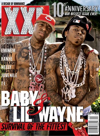
Front Cover Analysis
The magazine cover that i am analysing is XXL. The magazine cover uses several presentational devices to attract its audiences. These include alliteration, cover lines, main cover line, maine image, puff and tie-ins.
The USP - unique selling point of the magazine is the XXL masthead at the top of thepage. It is written in a big font to make it stand out. The red connotes excitement. It also has diamonds which connotes wealth. It utilises various cover lines stating the different artists featured in the magazine. This is to attract a wide range of audiences and is one of the main selling points of the magazine. The main image is of the two rappers 'Baby' and 'Lil Wayne'. Both rappers have a large amount of tatoo's and jewelry on their bodies. This helps to connote wealth. Both men are also topless. This could help to draw female audiences who would find this attractive. This could also help to attract a homosexual audience as topless men may attract a homosexual man. Another possible view is that it could connote toughness. Through the main image alone, it helps to attract a wider range of audience. The coverlines used are the names of several popular hiphop artists. This is one of the main selling points if the magazine as it helps to attract a fan base of several artists. It also uses 'puffs' which help tp make the front cover look more attractive. At the bottom of the magazine, we can see contact information, which is the website. The coverline containing the names of the artists featured within the magazine are successful in confirming audience expectations as the audience also expect to see some of their other favourite artists featured in the magazine. Utilizing these coverlines meets these expectations. The main image of the two rappres is also successful in confirming audience expectations as it is the centre of attention on the front cover, and it is a typical convention of a hip hop magazine. The logo of the magazine, XXL also meets audience expectations as it connotes wealth and it also writeen in contrasting colours which helps it to stand out. The connotation of wealth is an attraction to the typical audience of a hip-hip magazine. The main coverline(Baby&Lil Wayne) is also a successful feature of the front cover as it informs the viewer of the two main artists on the front cover. The background image is of a broken down house. This could be to attract young males who are attracted by the gangster culture as it shows two rich men in front of a broken down house which assumably is part of a area with high levels of poverty.
In conclusion, i think this front cover is highly successful in targeting its target audience as it contains the main features which are typical in a hip-hop magazine, however in my opinion i believe the front cover is a bit too 'flashy' and that it should be in a slightly more simple layout.

After this, i made a rough sketch of my magazine, to give me an outline of how my front cover will look like. I added all the features of a typical hiphop magazine front cover. These include a main image, coverlines, masterheads and background colours. This is to attract a hiphop target audience from the age range of 14-27. I decided to use a Medium shot looking straight on (direct mode of address) because following my research I have found that music magazines predominantly use direct mode of address. This is to make it more personal and made the reader involved in the front cover. I have chosen to make the name of my magazine 'music mayhem'. This is because the music industry generally always filled with the latest news and updates on artists, albums, songs ect. The title 'music mayhem' therefore connotes all the havoc and mayhem that is present in the music industry. I have chose the colour of my title to be in red as the colour red connotes energy and excitment. Another reason i used the colour red is through my research I have found that the majority of music magazine have the colour red somewhere on the front cover. I have decided to put the cover lines around the main image as this is an ideal location which would easily grab the attention of the reader. The cover lines are also in red which is a very bright and eye catching colour. This would again help the grab the readers attention. I have decided to put the bar code at the bottom right of the page. This is a typical location for bar codes on magazines and therefore this is why I decided to place my barcode in that location.
Questionnaireee
View more documents from harisraja1.
After creating a sketch of my front page, i made some audience questionnaires, asking the audience their opinions on music magazines. My questionnaire consisted of 12 questions, for the audience to either write down their answer or tick their preference in the tick boxes. I have mainly used closed questions as when people do questionnaires they want it to be a quick and easy proces.If I used mainly open questions then it would be very time consuming and this would put people off from doing the questionnaire.The objective of this questionnaire was to find out what was the most appealing features of a music magazines and what people would like to see. One of the questions was 'What genre of music do you prefer'. This was to find out the most popular genre so that i may base my magazine around this genre. Another question was 'What type of freebies would you like with your magazine'. This was to find out what was the most popular response so that i could use it for my magazine and make it more appealing to the viewer. I also asked the question 'How much are you willing to spend on a music magazine'. This is so that i could take the most popular response and base the price of my magazine around that price so that is would be more successful.
Questionnaire Results
View more presentations from harisraja1.
After i collected back the results of my audience questionnaires, i made these into graphs on microsoft powerpoint. I also wrote down comments on the results to show what the most popular resonses where.
Focus group audio interview
Texual Analysis

Both magazines use bold red font in upper case format. They are also written in a relatively large font. This is to make the logo/masthead instantly recognisable and to make it stand out. It grabs the attention of the viewer very effectively. Both Q magazine and NME share the same style of font.
In addition Q utilises a main image of three middle aged actors/singers. This may be used to attract a target audience of an older (25+) age group. On the other hand NME use the main image of a teenage boy band. This may help appeal to both male and female audiences of 14-20 age group who are into the rock/hiphop and pop genre of music.
The cover lines in the Q magazines are written in bold and brown typography. This helps tp grab the attention of the viewer and create an interest. In the NME magazine, we see at the top a coverline stating 'win awards tour tickets'. This also attracts the viewer through the use of competitions.
The backgrounds of both magazines also contrast as Q has a plain and simple white background and is contrasted by voloured lines and fonts. This helps to appeal to a more sophisticated audience. On the other hand the NME magazine is hardly visible as it is covered mostly by images, which helps to attract a younger, teenage audience.
Both magazines also utisise different font styles. The Q magazine uses simple and sohisticated font styles and covers. It is contrasted by the white background, and it therefore stands out. In the NME magazine, it uses a more stylish font and a wider variety of covers which help appeal to a younger age group.
Diary entries for practical work
Media Diary Entries For Practical Work
View more documents from guestf3e48bce.
Subscribe to:
Posts (Atom)